
File Management Platform
Reimagining how enrollment teams organize, manage, and access thousands of searches, orders, and fulfillment records within a single enterprise workspace.
Role
Senior Product Designer
Timeline
5 months
Responsibilities
Product Strategy • UX Architecture • Information Architecture • Interaction Design • Design Systems • Cross-functional Collaboration
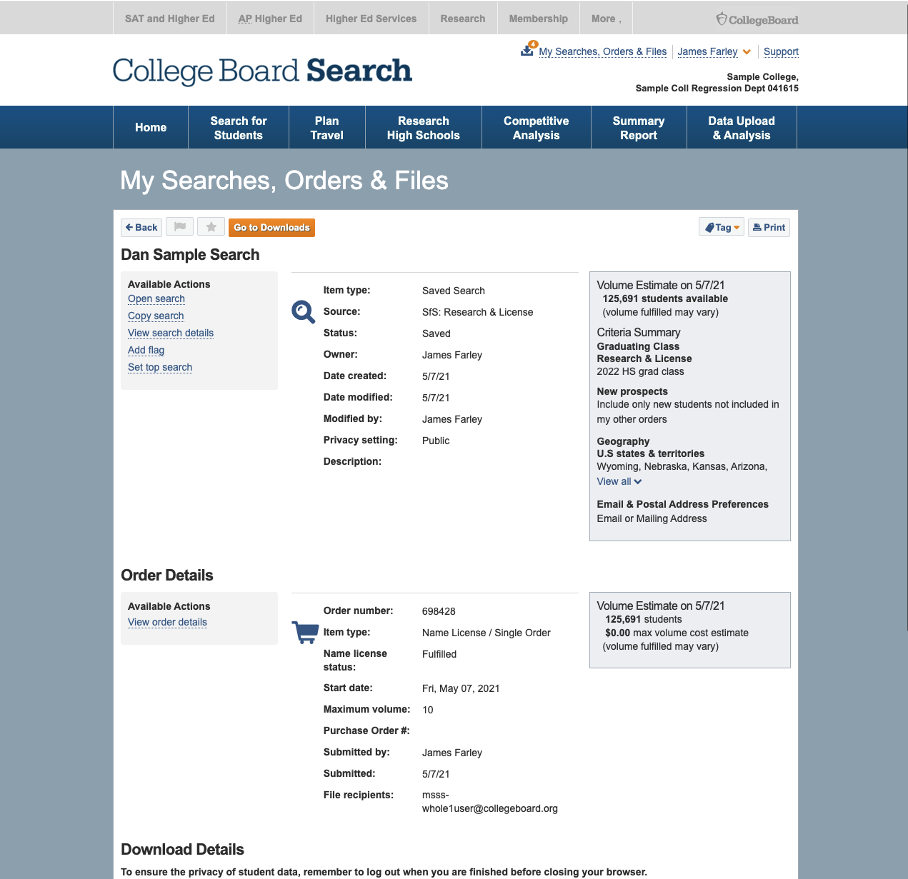
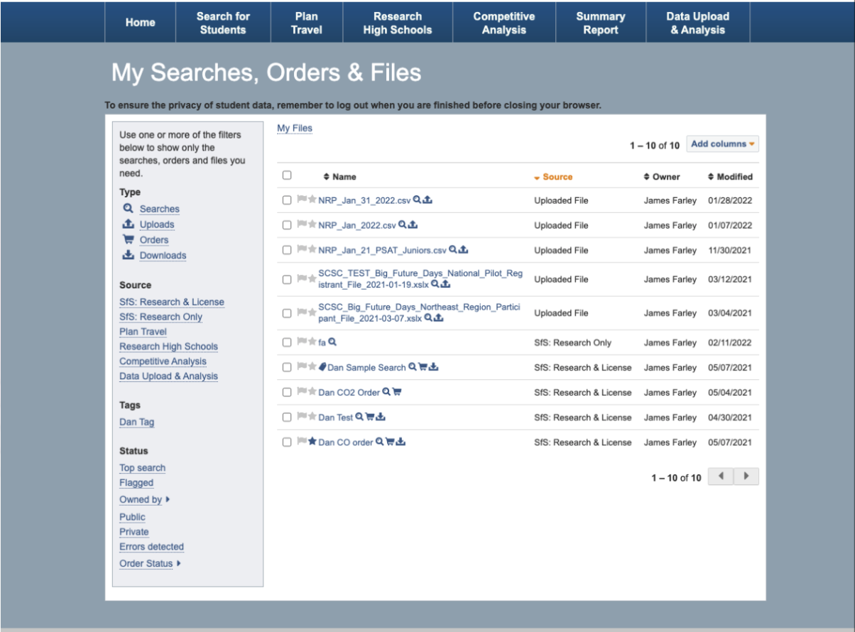
A fragmented operational experience
The original workspace evolved over many years, resulting in disconnected pages for searches, orders, downloads, and files.
Information was duplicated across multiple views, common actions required excessive navigation, and important details were buried within dense layouts.
As customers accumulated hundreds or even thousands of searches, locating and managing recruitment activity became increasingly difficult.
Key friction points
Searches, orders, and files were separated across multiple screens.
Critical actions required navigating into individual detail pages.
Important metadata was difficult to scan and compare.
Navigation reflected system architecture rather than customer workflows.
The interface struggled to support large, long-term datasets.
Opportunity
Rather than redesigning individual screens, I reframed the challenge as an information architecture problem.
The goal wasn't simply modernizing the interface—it was creating a centralized workspace where enrollment teams could quickly understand the status of their recruitment activity, locate information, and complete high-frequency tasks without unnecessary context switching.
Three principles guided the redesign:
Unify related workflows
Bring searches, orders, files, and fulfillment into one connected experience.
Surface actions sooner
Reduce navigation by exposing the tasks users perform most often directly within the workspace.
Design for scale
Support institutions managing thousands of searches while maintaining clarity and efficiency.
Solution
A centralized management workspace
The redesigned experience consolidated previously fragmented workflows into one operational hub where users could search, filter, review, and act on recruitment activity from a single location.
Instead of navigating between separate pages, users could manage the entire lifecycle of a search—from creation through fulfillment—within one consistent experience.
What changed
Unified searches, orders, and files into a single workspace.
Introduced advanced filtering for large datasets.
Added progressive disclosure to reduce visual complexity.
Surfaced inline actions for common workflows.
Improved hierarchy to make important information easier to scan.
Created reusable interaction patterns across the platform.
Design Decisions
Progressive disclosure
Rather than presenting every piece of information simultaneously, detailed metadata appears only when users request it. This reduced visual overload while keeping critical information immediately accessible.
Inline actions
Previously, users navigated through multiple pages to complete routine tasks. By surfacing actions directly within the list, the experience reduced unnecessary navigation and accelerated common workflows.
Flexible filtering
Enrollment teams often manage years of recruitment activity. The redesigned filtering system allows users to quickly locate searches based on status, dates, order types, and other operational criteria.
Scalable information architecture
The workspace was designed to remain usable as datasets grow, supporting institutions managing thousands of searches without sacrificing discoverability or efficiency.
Outcome
The redesign transformed My Searches, Orders & Files from a collection of disconnected administrative pages into a centralized operational workspace.
Product Outcomes
Consolidated fragmented workflows into a single management experience.
Reduced navigation complexity across high-frequency tasks.
Improved discoverability of searches, orders, and fulfillment information.
Established reusable interaction patterns used across the Student Search ecosystem.
Created a scalable information architecture supporting large enterprise datasets.
Strengthened continuity between Student Search, Bulk Ordering, and long-term order management.
Reflection
This project reinforced that enterprise UX is often less about creating new functionality and more about organizing complexity.
By redesigning the information architecture instead of individual screens, we created a workspace that better matched how enrollment teams actually managed recruitment over time. The result was a more scalable, discoverable, and cohesive operational experience across the broader Student Search platform.
Business problem + solution
Institutions used BFPM to control how their profiles appeared to students on BigFuture. The legacy experience was functional but fragmented: users lacked a clear view of profile completion, information-entry tasks were weakly structured, media uploads created uncertainty, and different roles encountered different permissions and expectations.
This mattered beyond administrative efficiency. Incomplete or inconsistent data and media weakened an institution’s ability to represent itself accurately and reduced the quality and trustworthiness of the downstream student-discovery experience.
I redesigned BFPM as a guided system rather than a collection of forms. The new experience introduced an action-oriented homepage, visible completion status, structured onboarding, clearer profile-information hierarchy, improved media-upload guidance and preview, role-aware navigation, and implementation-ready specifications.