
BIGFUTURE PROFILE MANAGEMENT (BFPM)
Product Design, UX Research,
Development, AI
BigFuture
Transforming a fragmented institution profile workflow into a guided onboarding and media management system for BigFuture.
Redesigned a fragmented, role-based admin workflow into a guided profile management system that improved completion clarity, reduced media upload uncertainty, and increased consistency across institution profiles used by 100+ institutions.
A senior-level product design case study focused on workflow redesign, role-based UX, onboarding clarity, content governance, media upload research, accessibility, and implementation-ready design systems thinking.
Role: Senior Product Designer, end-to-end ownership.
Partnered with: Engineering, QA, Content, Accessibility
Led: UX strategy, workflow redesign, specs
Scope: End-to-end product design, UX strategy, workflow restructuring, specs, prototyping, research synthesis
Timeline: 8 Months
Tools: Figma

Why It Mattered
BFPM supported institutions managing how they appeared on BigFuture. The existing experience was functional but fragmented. Key actions such as understanding profile completion, entering institutional information, uploading media, and navigating across profile-related tasks lacked a clear, guided structure. Different user roles also experienced the system differently, which added complexity to the product and increased the risk of confusion during onboarding and profile maintenance.
This project mattered because institutional data and media directly shaped student-facing experiences. If profiles were incomplete, unclear, or inconsistent, institutions struggled to present themselves effectively and students received a weaker, less trustworthy discovery experience.
The Problem
Clarity issues
No progress visibility
Unstructured inputs
System issues
Role ambiguity
Inconsistent data
Confidence issues (your strongest angle)
Media upload uncertainty
Lack of feedback/preview
The problem was not just about updating screens. It was about turning a static administrative experience into a guided system that could help institutions understand what to do, do it correctly, and feel confident that their profile would represent them well on BigFuture.
I led the end-to-end design direction for BFPM, shaping both the product experience and the implementation clarity needed to get it built well.
My responsibilities included:
Defining the end-to-end onboarding and profile management experience
Restructuring the information architecture and page hierarchy
Designing role-aware patterns and navigation logic
Improving profile completion visibility and action prioritization
Leading media upload experience direction through research synthesis
Creating detailed specs and annotations for engineering, product, and QA
Supporting scalable patterns that could extend across the platform
My Role
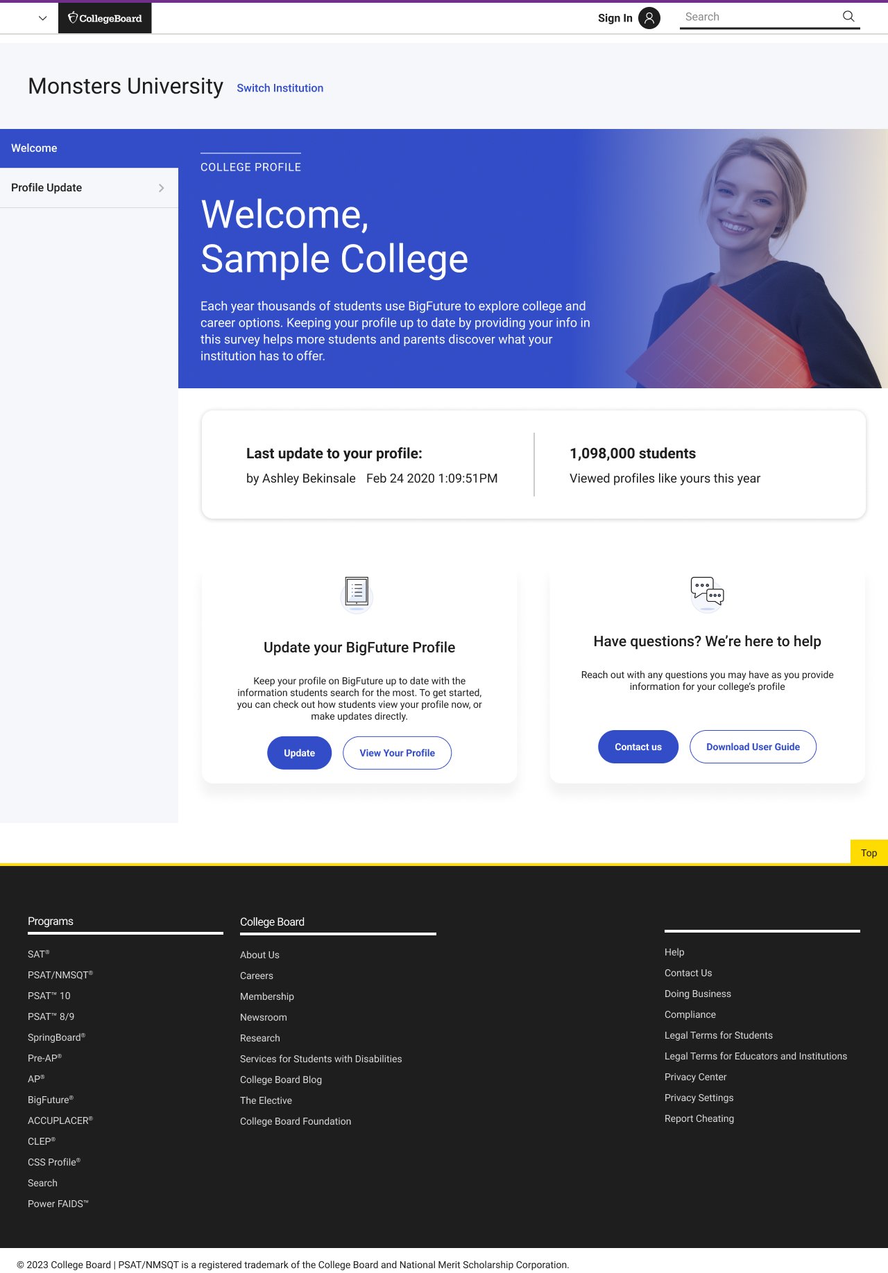
Legacy State
From static profile admin to guided profile completion
The legacy experience surfaced profile tasks, but it did not strongly guide institutions through them. Important actions were present, yet the workflow relied on users already understanding what mattered, what their role allowed, and how their updates would affect the final institution profile.
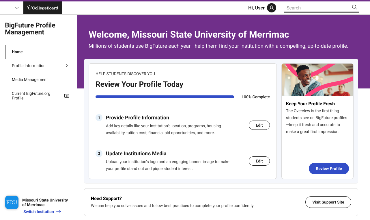
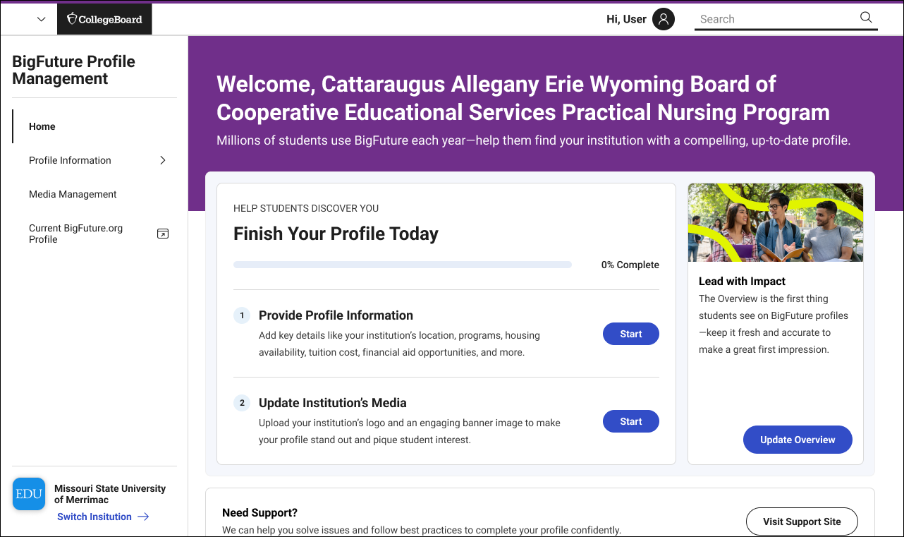
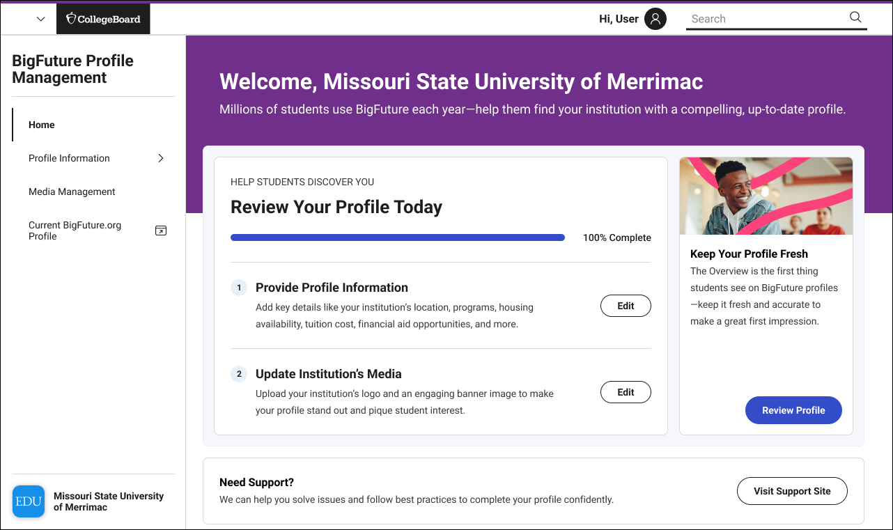
The redesign introduced a clearer home experience, stronger hierarchy, visible completion status, actionable task groupings, and a more intentional relationship between profile data, media assets, and institutional presence on BigFuture.
Before
Static homepage with no clear next action
No visible completion system
Media and profile tasks disconnected
After:
Action-driven homepage with completion tracking
Structured onboarding flow
Integrated media + profile workflow
Constraints and complexity
Multiple user roles with different permissions and expectations
Student-facing implications tied to admin-side data quality
Brand/media management sitting alongside structured profile data
Accessibility requirements affecting both form and media guidance
Need for implementation-ready documentation, not just polished UI
Cross-functional alignment between product, engineering, QA, and stakeholders
Balancing near-term MVP decisions with scalable future patterns
Designing for more than a form flow
Although BFPM could look like a straightforward admin tool on the surface, the design challenge was more layered. The product had to support role-based behavior, complex institutional information, brand asset management, accessibility considerations, and implementation precision, all while creating a clearer path for users who may not interact with the platform frequently.
Constraints and Complexity
Researching where confidence broke down
I led research synthesis across multiple inputs including moderated sessions, survey data, and internal audits. I translated findings into actionable UX decisions, particularly around media upload confidence and onboarding clarity.
Inputs I used
Existing workflows and product context
Legacy UI audit
Research on media upload pain points
User quotes and opportunity synthesis
Accessibility review / article inclusion
Affinity mapping and research questions
Cross-functional feedback from product and engineering
Research questions
Use the screenshots you have here.
Possible framing:
What made profile completion feel unclear or incomplete?
Where did users hesitate in the media upload process?
What information did users need before uploading logos or banners?
How could the system better communicate approval, constraints, and output quality?
How might we reduce ambiguity across user roles and tasks?
What I found
A. Users needed progress and guidance
The experience did not do enough to help users understand how far they had gotten, what remained, or what mattered most.
B. Media upload created outsized anxiety
Users were concerned about cropping, file requirements, accessibility, and whether their uploaded media would appear correctly once published.
C. Requirements were not visible at the right moment
Users needed clearer guidance around dimensions, formats, preview behavior, and post-upload feedback.
D. Accessibility needed to be part of the product, not an afterthought
Media and content guidance needed to support more inclusive usage and better content quality.
E. Role-aware systems need explicit structure
Navigation and permissions needed to feel understandable and predictable.
Research
Research evidence
Affinity mapping revealed recurring confusion around upload states and requirements
User quotes highlighted anxiety around “what happens after upload”
Survey data confirmed lack of confidence in media correctness
Key learning slide
Media upload quotes slide
Accessibility findings
Research method / approach
Key research questions slides
What the research made impossible to ignore
Cropping and size restrictions were a major pain point
Users wanted confidence that uploaded images would look correct after approval
Format, dimension, and accessibility guidance needed to be more explicit
Users needed preview states and better feedback loops
Approval and publication states needed stronger communication
Research Evidence
A guided, role-aware profile management system
Reframed homepage around completion and action
The new home experience gave institutions a clearer sense of what to do next, using progress visibility, task grouping, and more direct entry points into profile completion.
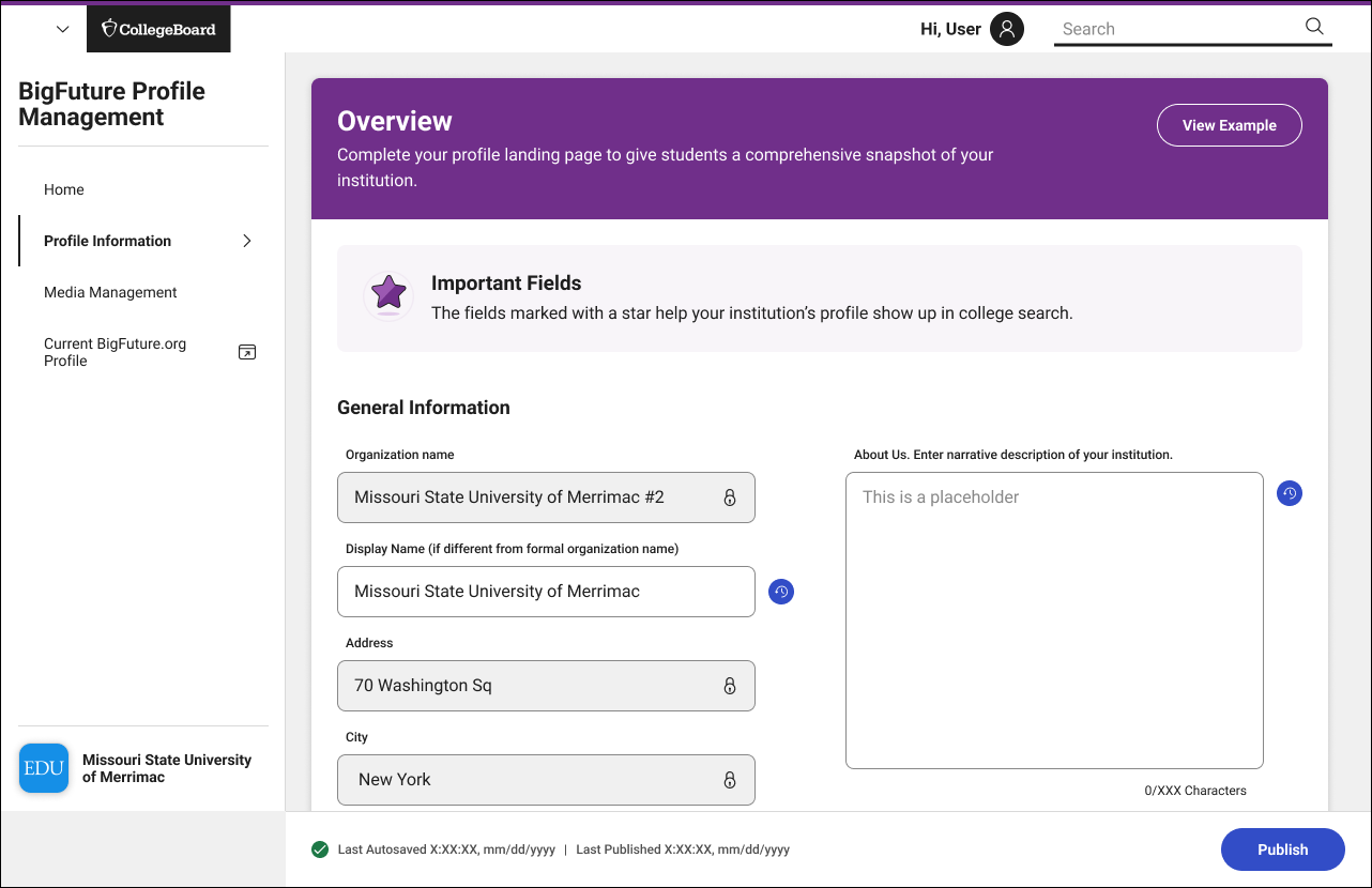
Created a clearer profile information flow
Profile information entry was restructured to feel more digestible, with improved form hierarchy and a better relationship between required inputs and overall profile quality.
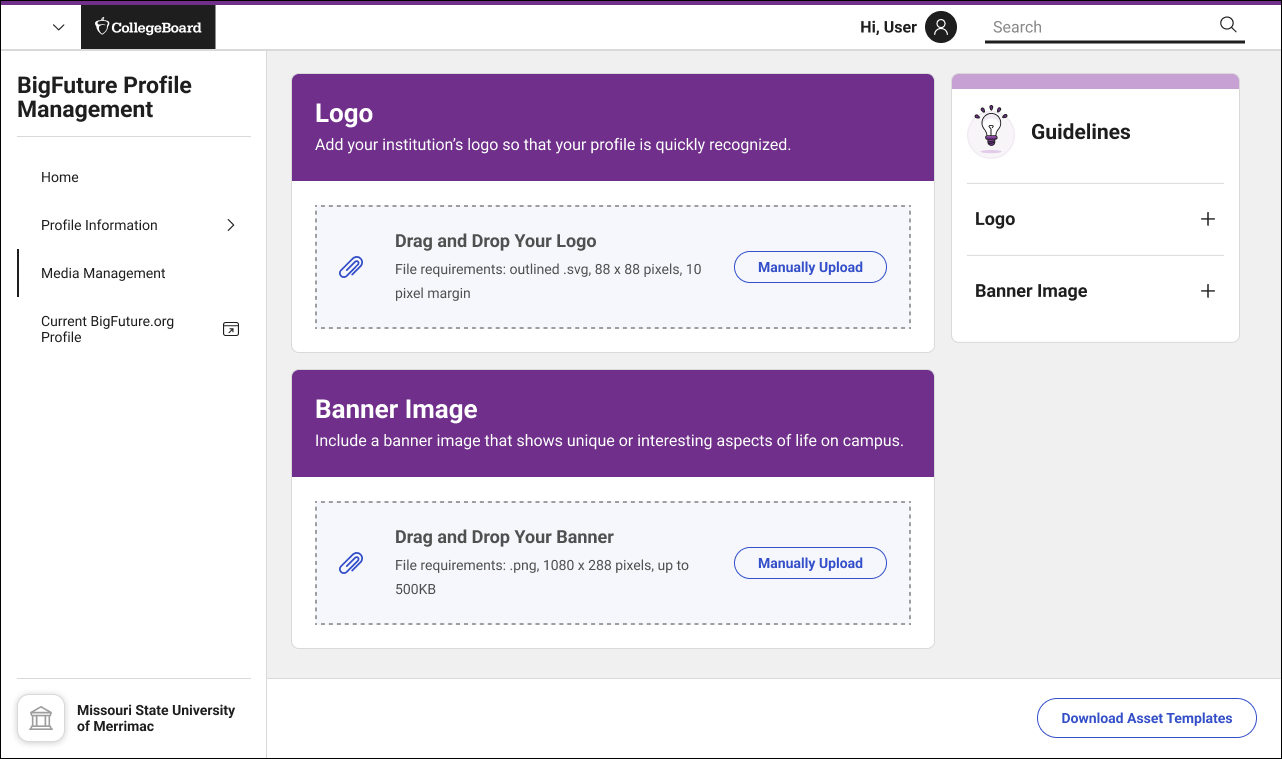
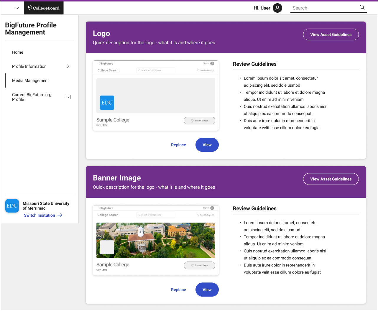
Improved media upload workflows
The design addressed uncertainty around logos and banner uploads by making requirements clearer and supporting a more confidence-building flow.
Introduced role-aware navigation and states
The system accounted for different admin conditions and permissions, creating a more predictable navigation model and clearer state behavior.
Supported implementation with detailed specifications
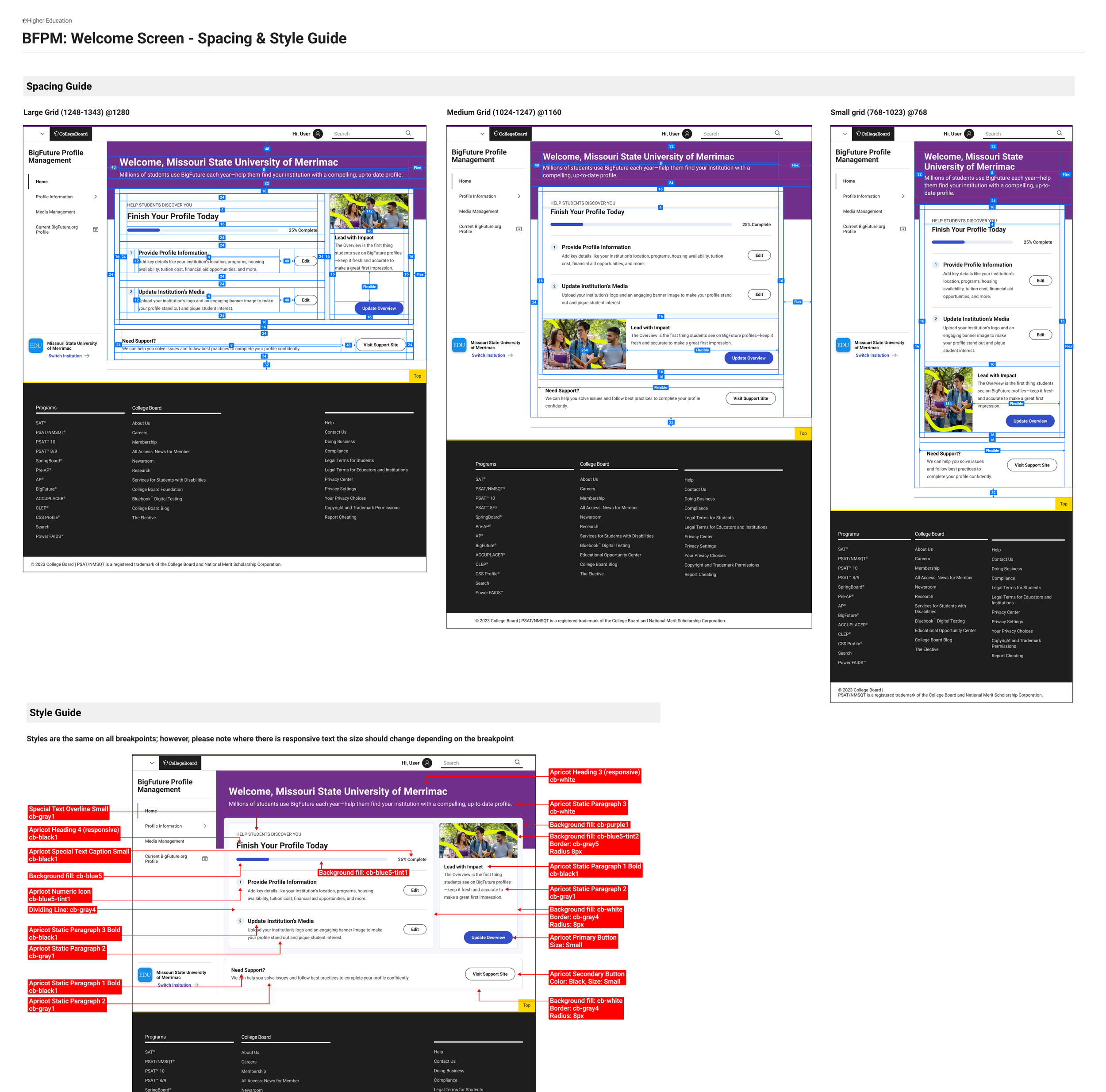
I created annotated specs, edge cases, spacing rules, state behaviors, and component-level guidance so engineering and QA could build with less ambiguity.
Improved Media Upload Workflows
User Flow
How The New Flow Works
01
Entry Point
User lands on the BFPM homepage and sees profile completion status and next actions.
02
Profile Complete
Returns to a homepage that reflects progress.
03
Upload Assets
Uploads logo and banner assets.
04
Enters profile information
Enter Information
05
Review
Reviews image choices and guidance.
Deep dive: reducing uncertainty in media upload
The challenge
Uploading logos and banners seems simple, but it carried a disproportionate amount of user anxiety. Users worried about dimensions, cropping, approval, accessibility, and how their assets would actually appear after publishing.
What research showed
Cropping and sizing restrictions were frustrating
Users wanted preview behavior before final submission
Users wanted clearer requirements and feedback
Accessibility considerations needed clearer support
Communication around approval and email notifications mattered
Design response
Bring requirements closer to the action
Make format/dimension guidance clearer
Use previews to reduce uncertainty
Clarify publication and approval states
Support more accessible content decisions
Why it matters
This work improved more than upload UX. It improved trust in the system and helped institutions feel more confident that their brand presence on BigFuture would be represented accurately.
Media Upload Deep Dive
Designing the product and the blueprint
A large part of the work was not only designing the experience, but making it buildable. I produced detailed specifications and annotations across layouts, spacing, components, navigation behavior, and edge cases so engineering, product, and QA could align around the intended behavior. This reduced ambiguity in implementation and helped translate design intent into a more reliable shipped product.
Layout/spacing annotations
Side navigation behavior
Role/state variations
Field-level guidance
Edge cases and exceptions
QA-ready documentation
Specs and Systems Thinking
Outcomes
Improved clarity in profile completion
Reduced uncertainty in media upload
Increased consistency across institution profiles
Impact
Reduced ambiguity for engineering and QA
Created scalable system for future growth
Design Principles
Guide, don’t overwhelm
Make progress visible
Design for confidence
Reduce ambiguity across roles
Build for implementation, not just visuals
The redesign moved BFPM from a static administrative experience toward a more guided system for profile completion and brand management. It clarified what users needed to do, reduced uncertainty in key flows like media upload, and created stronger implementation alignment across design, engineering, product, and QA.
Outcome / Impact
Takeaway
BFPM was a systems-heavy product challenge disguised as an admin workflow. The work required product thinking, UX clarity, research synthesis, accessibility awareness, role-based logic, and implementation precision. The outcome was a more guided experience that helped institutions better manage how they showed up on BigFuture.
Takeaway
What I’d refine next
Stronger preview and validation around media assets
More personalized task prioritization by role or institution state
Better approval-state communication and notifications
Richer profile health scoring beyond basic completion
Continued accessibility guidance embedded directly in the workflow
Reflection