
STUDENT SEARCH
Product Design, UX Design, UI Design, Visual Design,
Accessibility, User Testing, User Surveys, AI,
Cross-Function Collaboration
College Board
Designing a complex student segmentation and data purchasing system that enables institutions to identify, refine, and act on prospective student audiences.
Student Search allows colleges to define and purchase student datasets based on academic, demographic, and behavioral attributes.
These datasets power recruitment — emails, mailers, and outreach students receive.
I worked across the system to improve clarity, feedback, and decision-making in a highly complex filtering environment.
Role: Senior Product Designer, end-to-end ownership.
Partnered with: Engineering, QA, Content, Accessibility
Led: UX strategy, workflow redesign, specs
Scope: End-to-end product design, UX strategy, workflow restructuring, specs, prototyping, research synthesis
Timeline: 1 Year
Tools: Figma, Zeplin, High + Low Fidelity Prototyping
The System
This is not a single feature — it is an ecosystem.
Student Search spans:
search creation
filtering logic
saved searches & orders
subscription constraints
data uploads & segmentation
account + criteria management
Each part contributes to a single outcome: defining the right audience to purchase.
The Problem
The existing experience had grown into a powerful but fragmented system over time.
While feature-rich, it created friction across nearly every stage of the workflow.
Key issues
1. Lack of clarity in filtering logic
Users could select filters, but struggled to understand:
how filters combined
what impact they had on results
whether their audience was accurate
2. No real-time feedback
Audience size was unclear until late in the process
Users couldn’t confidently iterate
Filtering felt like trial-and-error
3. Fragmented workflows
Search creation, saved searches, orders, and uploads existed as:
separate tools
inconsistent interfaces
disconnected mental models
4. High cognitive load
Dense tables
Nested dropdowns
Overwhelming inputs
Users were forced to translate system logic instead of focusing on strategy
Legacy State
The legacy system reflected years of incremental feature additions:
inconsistent UI patterns
minimal hierarchy
poor visibility into system state
Users frequently lacked confidence in: “Did I actually build the right audience?”
Transform a complex, opaque system into one that:
provides continuous feedback
supports confident decision-making
scales across expanding datasets and features
connects the full workflow from search → purchase
Goal
Instead of simplifying the system (which wasn’t possible due to business complexity),
I focused on making the system legible.
This meant:
exposing system behavior
structuring complexity
reinforcing cause-and-effect relationships
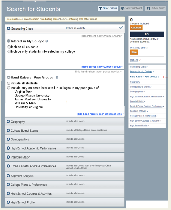
Insert: Students Included bar
As users apply filters:
audience size updates instantly
changes are visible and trackable
users can iterate with confidence
Why this matters
Previously:
users operated blindly
Now:
every action produces immediate feedback
This transforms filtering into:a feedback-driven decision system
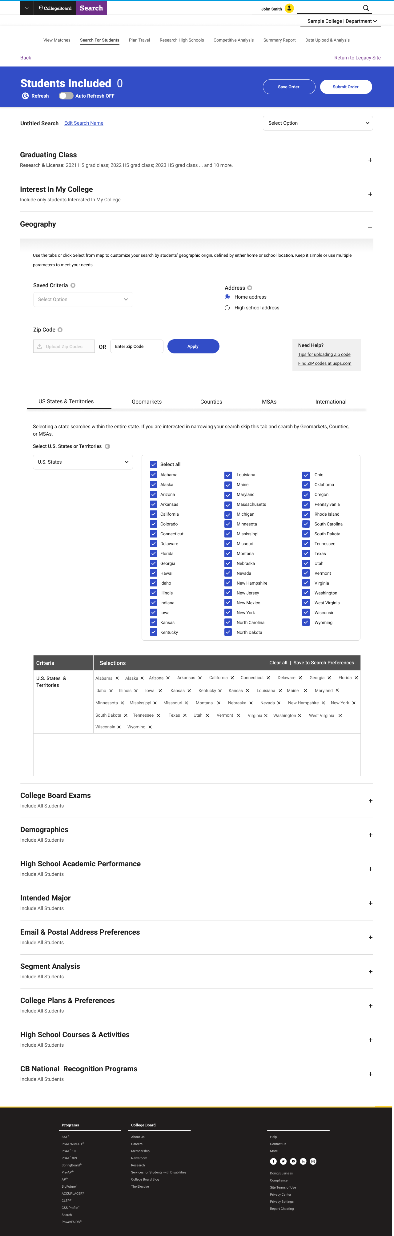
Structuring Complex Filters
The system includes dozens of filters across:
academics
geography
testing
demographics
behavioral data
Insert: Accordion filters
To reduce cognitive overload:
filters were grouped logically
sections were collapsible
users could focus on one dimension at a time
Impact
reduced overwhelm
improved scanability
increased task completion efficiency
Clarifying Filter Logic
One of the most confusing areas was how filters combined.
Insert: AP / SAT logic UI
Users struggled with:
OR vs AND logic
inclusion vs exclusion
overlapping conditions
Design decisions
made logic more explicit
surfaced relationships between filters
clarified outcomes through UI structure
Result
Users could understand not just what they selected — but what it meant
Instead of simplifying the system (which wasn’t possible due to business complexity),
I focused on making the system legible.
This meant:
exposing system behavior
structuring complexity
reinforcing cause-and-effect relationships
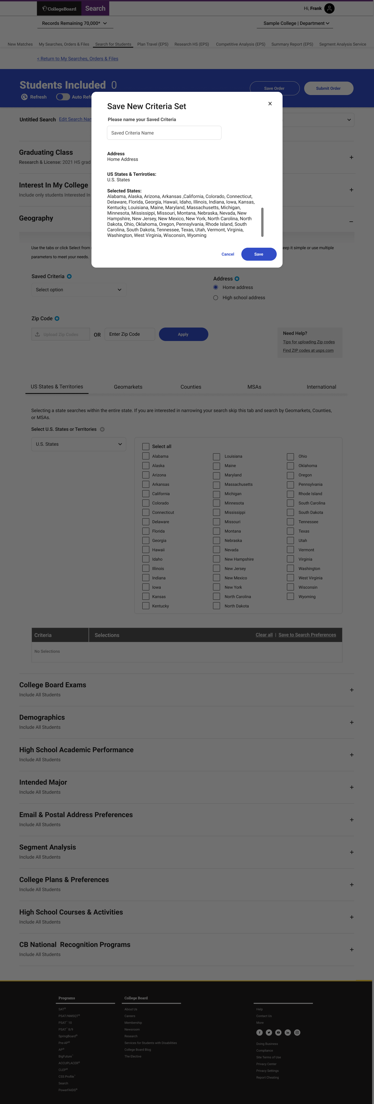
4. Persistent Context & Actionability
Users frequently needed to:
monitor dataset size
save progress
submit orders
Key actions were made persistent:
visible at all times
accessible without context switching
Impact
reduced friction
improved flow continuity
supported long, multi-step workflows
5. Expanding the Data Model
New capabilities were introduced to support more nuanced targeting.
Landscape Context
This included:
environmental and neighborhood data
expanded segmentation options
contextual scoring systems
Challenge
Adding complexity without increasing confusion
Solution
integrated into existing patterns
maintained consistency across filters
introduced progressively
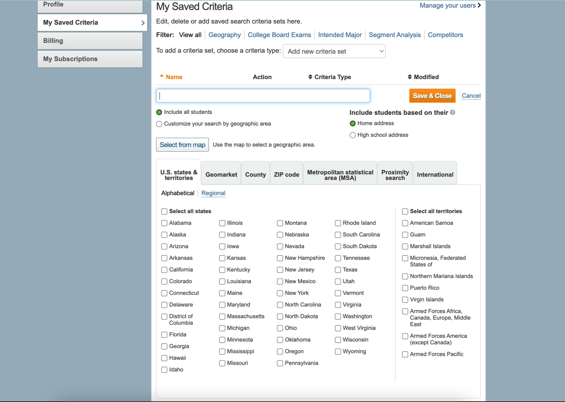
6. Connecting the Ecosystem
Student Search does not exist in isolation.
It connects to:
saved searches
orders & downloads
subscription plans
uploaded datasets
My Searches / Orders page
Design focus
unify interaction patterns
maintain consistency across pages
reduce re-learning
7. Supporting Custom Data Input
Users can upload their own data for segmentation.
Upload + Segment Analysis
This required:
new workflows for file handling
tagging and clustering systems
integration with search filters
Impact
Expanded system from:
static data → dynamic, user-driven segmentation
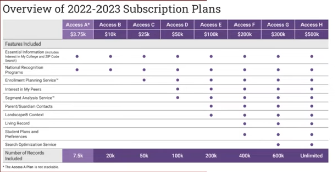
8. Designing Within Business Constraints
Access to features is tied to subscription tiers.
This introduces constraints on:
dataset size
feature access
filtering capabilities
Design challenge
Balance:
transparency
usability
monetization
Approach
clearly communicate limits
avoid blocking user workflows abruptly
guide users toward valid actions
Approach
Research evidence
Affinity mapping revealed recurring confusion around upload states and requirements
User quotes highlighted anxiety around “what happens after upload”
Survey data confirmed lack of confidence in media correctness
Key learning slide
Media upload quotes slide
Accessibility findings
Research method / approach
Key research questions slides
What the research made impossible to ignore
Cropping and size restrictions were a major pain point
Users wanted confidence that uploaded images would look correct after approval
Format, dimension, and accessibility guidance needed to be more explicit
Users needed preview states and better feedback loops
Approval and publication states needed stronger communication
Research Evidence
User Flow
How The New Flow Works
01
Entry Point
User lands on the BFPM homepage and sees profile completion status and next actions.

02
Profile Complete
Returns to a homepage that reflects progress.

03
Upload Assets
Uploads logo and banner assets.

04
Enters profile information
Enter Information
05
Review
Reviews image choices and guidance.
Outcome
The redesigned system shifted Student Search from a static filtering tool into a feedback-driven decision system.
Users can now iterate on audience selection in real-time, rather than relying on trial-and-error
Increased confidence in filter selection and dataset accuracy
Reduced reliance on external support for complex search creation
Improved ability to understand how filters affect outcomes before purchase
Product & System Impact
Established a scalable filtering framework across search and segmentation workflows
Introduced real-time feedback patterns that improved visibility into system behavior
Unified fragmented experiences into a cohesive, end-to-end workflow
Created a foundation for expanding data inputs, segmentation models, and new features
Business Impact
Enabled more precise audience targeting, improving the quality of purchased datasets
Reduced risk of incorrect or inefficient data purchases
Supported clearer alignment between product capabilities and subscription models
Strengthened the system’s role as a core driver of institutional recruitment strategies
Outcome / Impact
Reflection
Designing this system required balancing:
user needs
data complexity
business constraints
The biggest shift was moving from interface design → decision system design
Every interaction shapes:
who institutions reach
how students are targeted
and ultimately, access to opportunity
Reflection
Transform a complex, opaque system into one that:
provides continuous feedback
supports confident decision-making
scales across expanding datasets and features
connects the full workflow from search → purchase
Approach