
ENTERPRISE SEARCH PLATFORM
Product Design, UX Design, UI Design, Visual Design,
Accessibility, User Testing, User Surveys, AI,
Cross-Function Collaboration
College Board
Designing a complex student segmentation and data purchasing system that enables institutions to identify, refine, and act on prospective student audiences.
Student Search allows colleges to define and purchase student datasets based on academic, demographic, and behavioral attributes. These datasets power recruitment — emails, mailers, and outreach students receive.
This is not a single feature — it is an ecosystem.
Student Search spans:
search creation
filtering logic
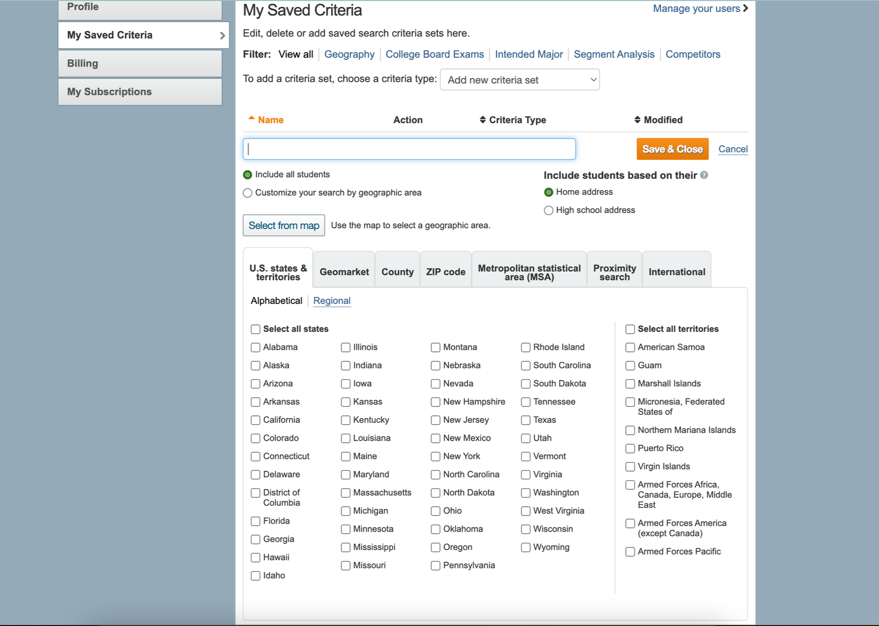
saved searches & orders
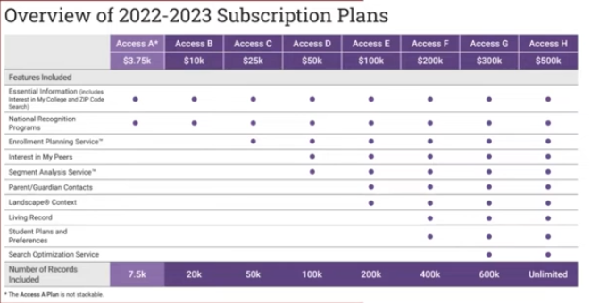
subscription constraints
data uploads & segmentation
account + criteria management
Each part contributes to a single outcome: defining the right audience to purchase. I worked across the system to improve clarity, feedback, and decision-making in a highly complex filtering environment.
Role: Senior Product Designer, end-to-end ownership.
Partnered with: Engineering, QA, Content, Accessibility
Led: UX strategy, workflow redesign, specs
Scope: End-to-end product design, UX strategy, workflow restructuring, specs, prototyping, research synthesis
Timeline: 1 Year
Tools: Figma, Zeplin, High + Low Fidelity Prototyping
The Problem
The existing experience had grown into a powerful but fragmented system over time.
While feature-rich, it created friction across nearly every stage of the workflow.
Key issues
1. Lack of clarity in filtering logic
Users could select filters, but struggled to understand:
how filters combined
what impact they had on results
whether their audience was accurate
2. No real-time feedback
Audience size was unclear until late in the process
Users couldn’t confidently iterate
Filtering felt like trial-and-error
3. Fragmented workflows
Search creation, saved searches, orders, and uploads existed as:
separate tools
inconsistent interfaces
disconnected mental models
4. High cognitive load
Dense tables
Nested dropdowns
Overwhelming inputs
Users were forced to translate system logic instead of focusing on strategy
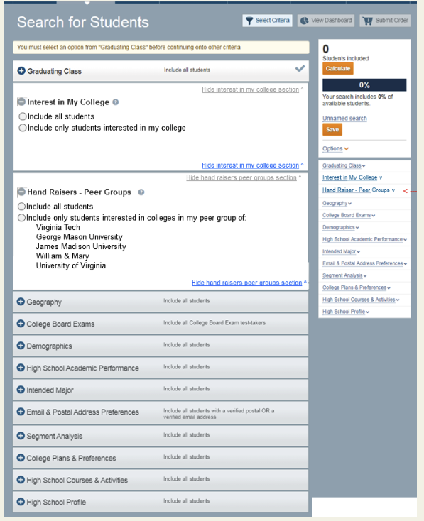
Legacy State
The legacy system reflected years of incremental feature additions:
inconsistent UI patterns
minimal hierarchy
poor visibility into system state
Users frequently lacked confidence in: “Did I actually build the right audience?”
Transform a complex, opaque system into one that:
provides continuous feedback
supports confident decision-making
scales across expanding datasets and features
connects the full workflow from search → purchase
Goal
Making a Complex Data System Legible
Student Search is an enterprise SaaS platform used by enrollment teams to identify, segment, and order student audiences from a large and highly detailed dataset.
Because the system supported complex business rules, dozens of filters, subscription-based access, and multiple connected workflows, simply removing functionality was not an option.
Instead of reducing the system’s complexity, I focused on making that complexity understandable, visible, and actionable.
My design approach centered on three principles:
Expose system behavior
Structure information clearly
Reinforce cause-and-effect relationships
Approach
Turning Filtering Into a Data Visualization
A primary challenge was helping users understand how each filter affected the size and composition of their audience.
Previously, users could apply multiple criteria without clearly seeing the impact of their decisions. They were often operating blindly and had limited confidence in whether their search would produce a useful audience.
I introduced a persistent Students Included visualization that updated as users adjusted their criteria.
As filters were applied:
Audience size updated immediately
Increases and decreases became visible
Users could compare the impact of different criteria
Potentially restrictive combinations could be identified earlier
Users could refine their strategy without leaving the workflow
This transformed the result count from a passive number into an active decision-making tool.
Rather than simply showing how many students matched, the visualization created a continuous feedback loop between user input and system output.
Result
Filtering became a feedback-driven decision system in which users could test, evaluate, and refine their audience with greater confidence.
Structuring Complex Filters & Data insights
Student Search gives enrollment teams access to a rich dataset containing thousands of student records and dozens of segmentation criteria. The challenge wasn't reducing complexity—it was helping users confidently navigate and understand it.
To support this, I designed both the filtering experience and the accompanying data visualizations to work together as a unified decision-support system.
Organizing Complex Filters
The platform included filters across multiple dimensions, including:
Academics
Geography
Testing
Demographics
Student interests
Behavioral data
Environmental and neighborhood insights
Rather than exposing every option at once, filters were grouped into logical, collapsible sections using progressive disclosure. This allowed users to focus on one category at a time while maintaining awareness of the broader filtering system.
Design decisions
Organized filters into meaningful categories
Reduced visual noise through accordion sections
Maintained consistency across filter interactions
Surfaced advanced options only when needed
Impact
Reduced cognitive overload
Improved scanability
Increased task completion efficiency
Supported large-scale enterprise workflows
Beyond Search: Turning Student Data Into Actionable Insights
Creating a student audience was only one part of the recruitment workflow. Enrollment teams also needed to understand the composition and potential value of their selected audience before moving forward.
I helped design the Segment Analysis Service (SAS), a connected reporting experience that transformed large student datasets into accessible visual insights.
The challenge
Enrollment teams previously relied on dense tables and exported spreadsheets to analyze student populations. This made it difficult to quickly identify patterns, compare audience segments or determine whether a selected audience supported their recruitment goals.
Users needed to answer questions such as:
How is this audience distributed geographically?
Which student segments are most represented?
How do different cohorts compare?
Are there gaps or unexpected patterns in the data?
Does this audience align with our recruitment strategy?
Designing the dashboard
I designed a reporting experience that connected interactive filtering, data visualization and detailed student data within one interface.
The dashboard allowed users to:
Compare student cohorts and clusters
Explore geographic and demographic distributions
Review historical audience performance
Apply filters without leaving the report
Move between summary visualizations and detailed tables
Export reports for additional analysis
Rather than presenting every control at once, I organized filters into progressive sections. This helped users focus on the information most relevant to their analysis while preserving access to advanced criteria.
Connecting search and analysis
Student Search and SAS served different parts of the same decision-making process:
Define an audience → Evaluate its composition → Compare segments → Refine the strategy → Place an order
By connecting the filtering and reporting experiences, the platform supported more than audience creation. It helped enrollment teams understand the students represented by their selections and make more informed recruitment decisions.
Outcome
The redesigned experience shifted Student Search from a static filtering tool into a more transparent decision-support system.
User impact
Gave users immediate visibility into how criteria affected audience size
Made complex filters easier to scan and understand
Helped users identify overly restrictive combinations earlier
Connected audience creation with deeper segment analysis
Reduced the need to move between disconnected tools and spreadsheets
Product impact
Established scalable filtering patterns across search and reporting
Unified previously fragmented search, analysis and ordering workflows
Created reusable interaction patterns for future datasets and features
Improved visibility into system behavior throughout the user journey
Business impact
Supported more precise audience targeting
Reduced the risk of purchasing an incorrectly configured dataset
Helped institutions make more informed recruitment decisions
Strengthened Student Search as a strategic recruitment platform rather than a transactional purchasing tool
Reflection
The central challenge was not eliminating complexity. Student Search needed to support detailed data, business rules, subscription constraints and advanced institutional workflows.
My role was to make that complexity visible and understandable.
By pairing structured filtering with continuous feedback and interactive reporting, we transformed the experience from a collection of inputs into a connected decision-making system.
User Flow
Selecting filters
Outcome / Impact
Reflection
Visual Dashboard
Beyond Search: From Finding Students to Understanding Them
Student Search wasn't limited to finding the right audience. It also included tools that helped enrollment teams analyze, compare, and validate their search results before making strategic decisions.
As part of the broader Search ecosystem, I designed experiences for the Segment Analysis Service (SAS), where users could transform large student datasets into interactive reports and visualizations.