
SEGMENT ANALYSIS SERVICE
Enterprise Data Visualization and Decision Support - Turning Complex Enrollment Data Into Actionable Decisions
Role: Senior Product Designer; end-to-end product ownership
Focus: Data Visualization, Information Design, Enterprise UX, Accessibility
Product: B2B SaaS / Enterprise Analytics
Users: College and university enrollment teams
Team: Product, Engineering, QA, UX Research, Content Strategy, Accessibility and stakeholders
Tools: Figma, FigJam, enterprise design system, user interviews
Timeline: 5 weeks
Redesigning College Board’s Segment Analysis Service to help enrollment professionals upload institutional data, interpret student segments, compare performance, and act on insights with greater confidence.
The product
Segment Analysis Service helps colleges analyze their enrollment data through College Board’s student-segmentation framework. Institutions upload student records, receive enriched cluster data, and use reports to understand which student groups are progressing from prospect to enrollment.
My role
As Senior Product Designer, I led the experience and visual design across the upload, processing, reporting, and accessibility workflows. I translated complex analytical requirements into an understandable interface while defining reusable patterns for filters, chart interactions, tables, system feedback, and accessible color presentation.
End-to-end workflow and information architecture
Dashboard and report hierarchy
Data-visualization design
Filter and comparison patterns
Accessibility modes and chart-color testing
Upload, validation, confirmation, and processing states
Collaboration with product, engineering, analytics, and accessibility partners
Reusable interaction patterns for future analytics products
Users and decisions
I designed around the decisions users needed to make—not around the structure of the underlying dataset.
Enrollment leaders evaluating recruitment strategy
Admissions analysts investigating student populations
Institutional users preparing data for analysis
Staff translating report findings into student-search criteria
Questions the experience needed to answer
Which student segments are strongest or weakest?
Where do prospects drop off between applicant, admit, and enroll?
How do results differ across cohorts or uploaded files?
Which clusters should be targeted in future recruitment?
Can users trust that the uploaded information was processed correctly?
This shifted the product from “generate a report” toward a decision-support experience: select the correct evidence, understand what matters, compare performance, and move the insight into an actionable recruitment workflow.
Experience strategy
I organized the experience to match the user’s mental model rather than exposing every analytical capability at once. New users receive orientation and guidance, while returning users can move directly into uploads, cluster definitions, or historical reports.
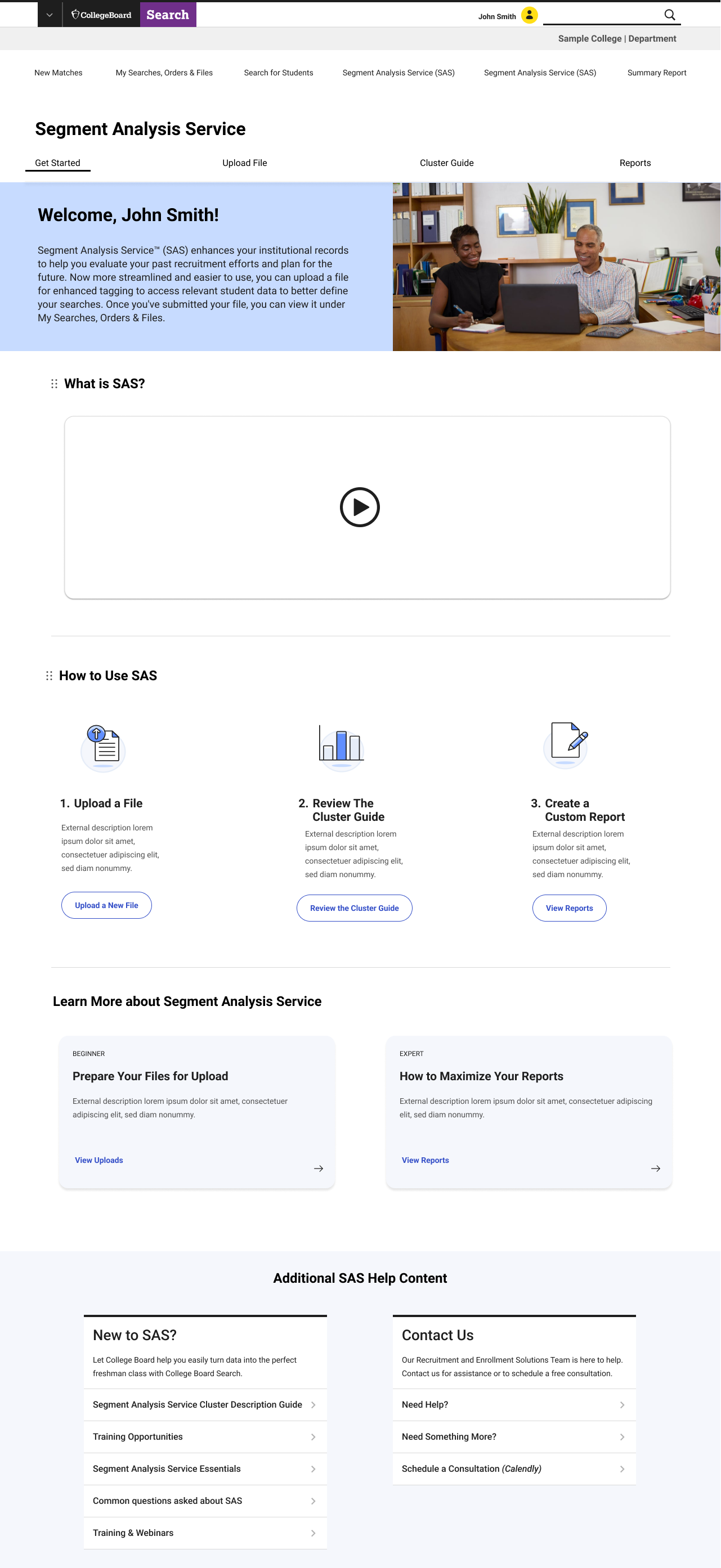
GET STARTED
Understanding the service
and available actions.UPLOAD FILE
User prepare, upload, validate, and
submit institutional data.
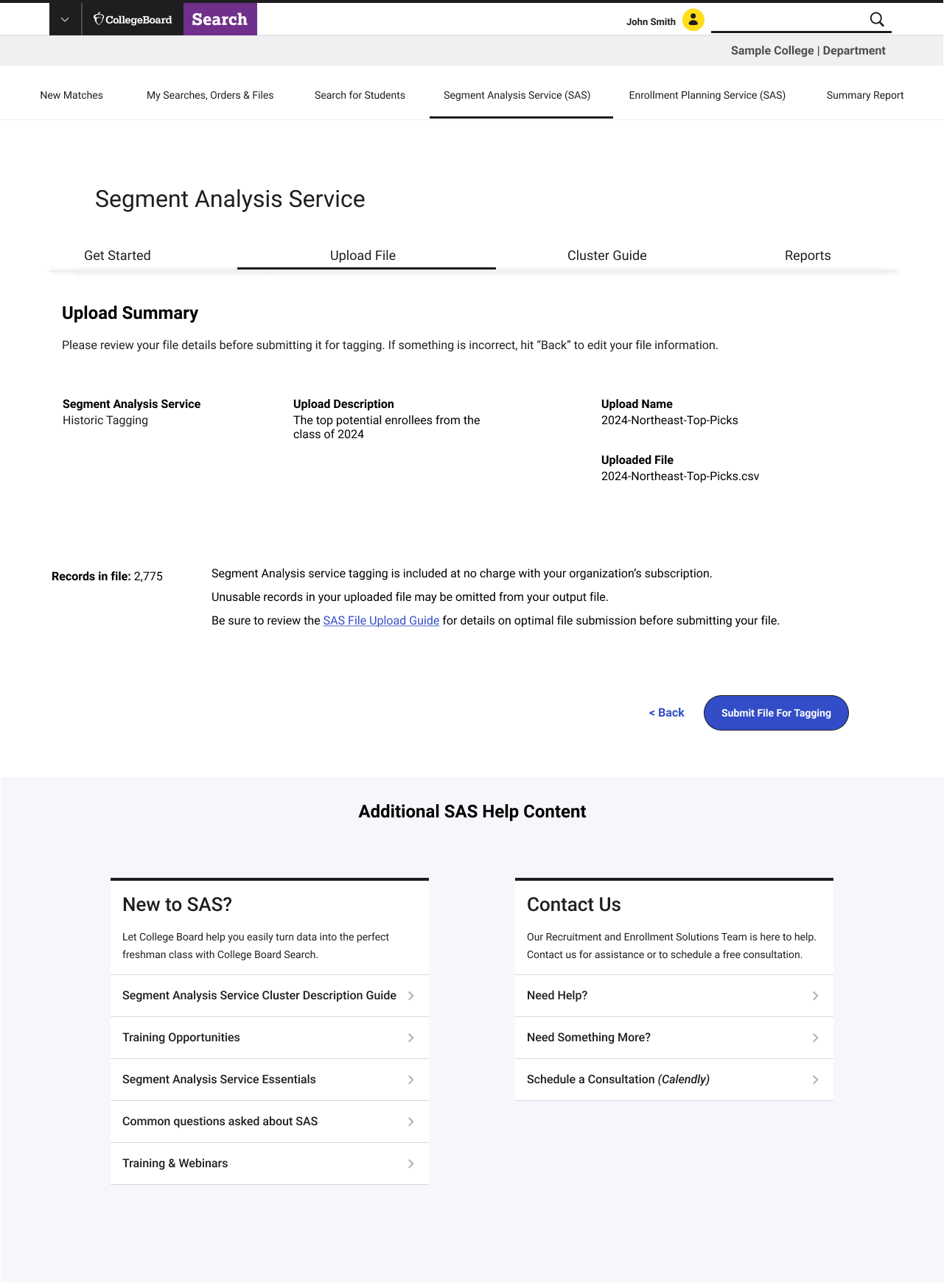
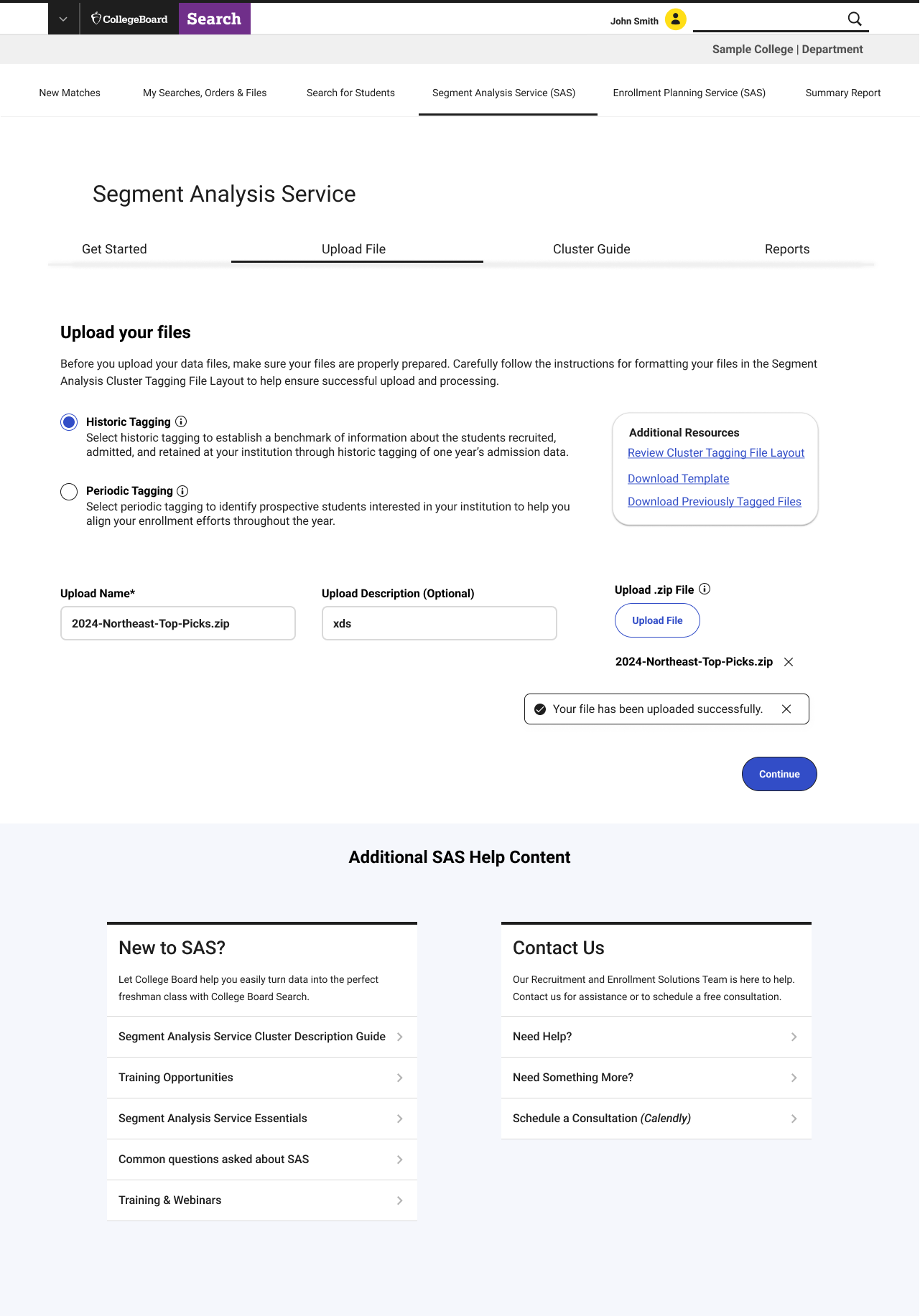
Users needed to prepare and submit institutional data before they
could generate a report. I designed a guided upload process that
explains the available options, provides resources when needed,
confirms the file was uploaded successfully, and lets users
review everything before submission.Clear explanations for historic and periodic tagging
File templates and preparation instructions
Required and optional fields
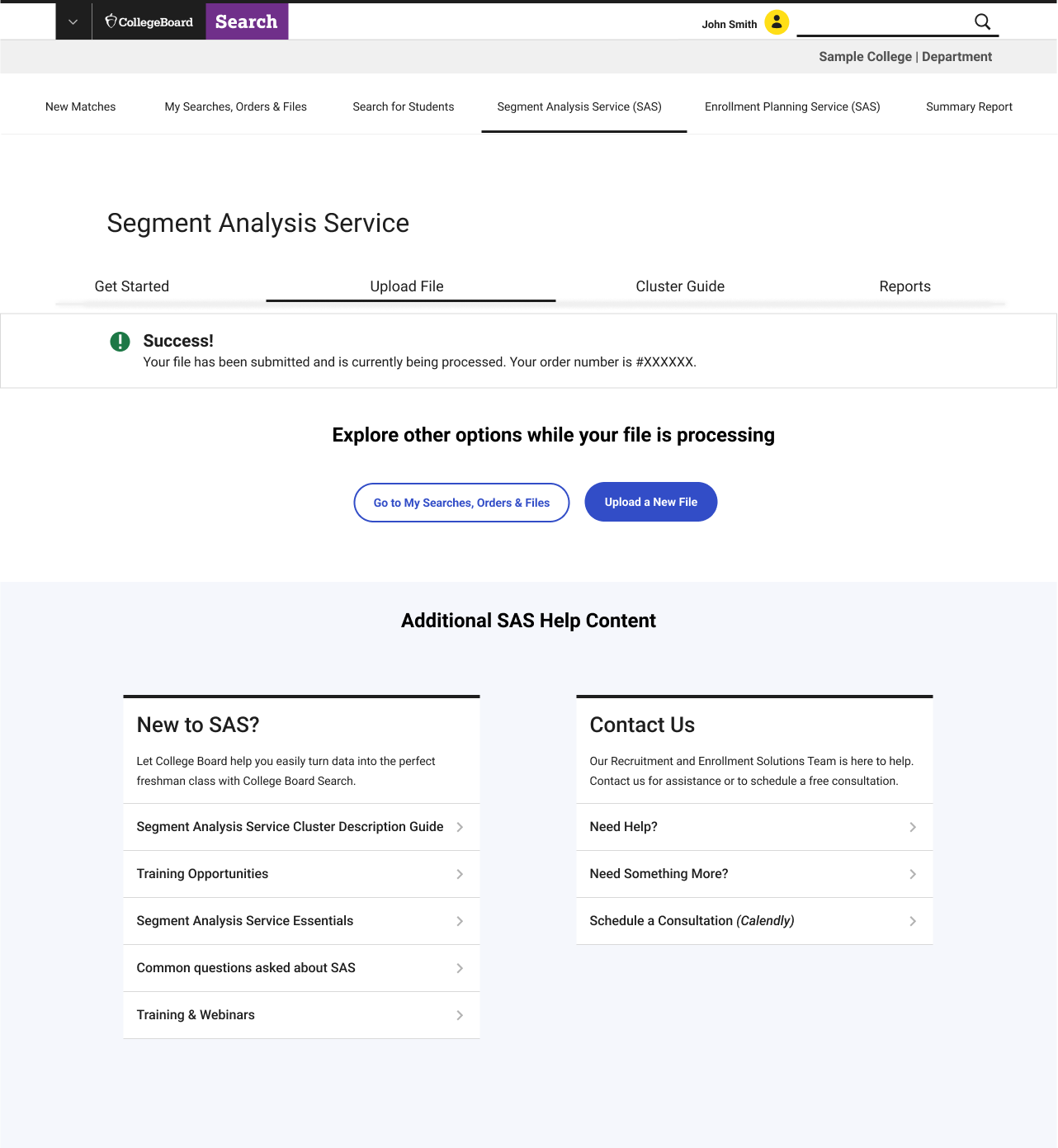
Upload success and processing messages
A review screen before final submission
Clear next steps after submission
The new workflow helps prevent upload mistakes and keeps
users informed throughout the process.
CLUSTER GUIDE
Understand the meaning behind each
segment.REPORTS
Filter, compare, interpret, download
and apply results.


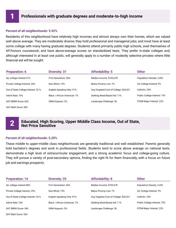
Making the Data Accessible and Trustworthy
Accessibility was part of the information design—not an afterthought
With multiple student clusters displayed at once, relying on color alone could make the report difficult to interpret and increase the risk of users reaching the wrong conclusion.
I designed an accessibility option that adjusted the color palette while preserving the relationship between the chart, legend, and table. Cluster names, exact values, headings, and positional patterns remained visible so users did not have to depend entirely on color recognition.
This approach improved the experience for users with visual disabilities while also making the report clearer for anyone reviewing dense or unfamiliar data.
Accessibility principles applied
Color was supported by labels and numerical values
Categories remained consistent across charts, legends, and tables
Selected, disabled, and focus states remained visible
Supporting tables provided an exact-value alternative
Keyboard behavior was considered across filters and actions
Information remained understandable without color alone
Accessibility statement
Designed with accessibility guidance and evaluated against applicable accessibility standards. Formal WCAG compliance would require a complete implementation audit.
The Challenge
Accurate data was available, but understanding and acting on it required too much interpretation.
Enrollment professionals needed to move between data preparation, uploaded files, static cluster documentation, historical reports, and student-search tools. The experience placed a high cognitive burden on users and did not clearly communicate what was required, what the data represented, or what action should follow.
Core problems
Users needed specialized knowledge to interpret cluster codes.
Required report criteria were not clearly separated from optional filters.
Visualizations contained many categories competing for attention.
Users needed to compare multiple stages of the enrollment funnel.
Report findings had to connect back to student recruitment workflows.
Uploading and processing data lacked sufficient visibility and reassurance.
Color-dependent reporting created accessibility and comprehension risks.


Applying Human-Centered Visualization Principles
The system was designed around how people scan, compare, and understand information
I used visual hierarchy to direct attention toward the most important information first. Position and bar length supported quick comparison, while color and grouping helped users recognize related categories.
Filters were grouped by purpose, report controls remained visually separate from results, and repeated patterns behaved consistently throughout the workflow. Optional complexity was introduced only after users completed the required report setup.
Exact labels and values remained available alongside the visualization so users could confirm what they were seeing. This helped balance quick pattern recognition with the accuracy and credibility expected from an enterprise analytics product.
The design principles
Hierarchy: Lead with the primary question and most important result
Comparison: Use stable positioning and scale across enrollment stages
Grouping: Keep related filters, controls, and report actions together
Consistency: Preserve the same category mapping throughout the experience
Progressive disclosure: Introduce advanced options only when relevant
Trust: Let users verify every visual pattern through supporting values
Creating Reusable Visualization Standards
The project established a foundation that could extend beyond one report
As lead visual designer, I used this work to advocate for stronger data-visualization capabilities across College Board products.
The existing design system supported general interface patterns but offered limited guidance for analytical experiences. This project identified the need for expanded color options, reusable graph components, accessible palettes, standardized legends, report states, and consistent filter behavior.
I worked to make these patterns reusable so future product and analytics teams would not have to solve the same visualization problems independently.
PatternStandard establishedReport setupRequired inputs appear before optional controlsFiltersConsistent counts, update, reset, and clear behaviorEmpty statesExplain what is missing and what users should do nextChart colorsStable category mapping with accessible alternativesLegendsConsistent placement, labels, and chart relationshipsData tablesExact counts and percentages support visual interpretationReport actionsConsistent placement for generation, download, and next stepsSystem feedbackShared loading, success, processing, and error statesGraph componentsReusable chart structures designed for future products
This expanded my role beyond designing a single report. I became a voice for visual design across the organization—helping teams understand when visualization was useful, how color could communicate meaning, and how reusable graph patterns could broaden what the design system offered.
Leading Across Product, Analytics, and Engineering
Translating analytical requirements into patterns teams could implement consistently
I partnered with product, analytics, engineering, accessibility, and design-system teams to balance data accuracy with user comprehension.
My role was not to determine the underlying analysis. My responsibility was to understand what the data represented, clarify which comparisons were meaningful, and design the clearest way for users to interpret and act on those findings.
I led decisions around:
Report hierarchy and visual storytelling
Chart structure and category encoding
Valid comparison and aggregation states
Loading, empty, error, and processing experiences
Accessible color and interaction behavior
Reusable graph and filter components
Expansion of the design system’s visualization options
Handoff guidance for future analytical products
This work helped bridge the gap between technically accurate data and an experience users could understand, trust, and use.
Measuring Success
Success meant users could configure, interpret, and act on the report
The experience was evaluated around three questions:
Could users build a valid report without unnecessary assistance?
Could they correctly interpret the most important patterns?
Could they turn those findings into a recruitment action?
10% increase in successful report configuration
9% decrease in time required to generate a valid report
12% decrease in file-upload or configuration errors
29% improvement in identifying top- and bottom-performing clusters
23% increase in reports leading to saved recruitment criteria
33% reduction in report-related support requests
30+ reusable visualization patterns introduced or identified
15 College Board experiences positioned to adopt the new patterns
Impact
From a static report to a connected decision-support experience
The redesign connected data preparation, report configuration, visualization, verification, and recruitment action within one coherent experience.
Clearer decisions
Users could recognize important patterns without manually interpreting a dense report.
More trustworthy information
Charts, direct labels, legends, and tables allowed users to scan the data and verify exact values.
More inclusive reporting
Accessible palettes and redundant visual cues reduced dependence on color alone.
More actionable insights
Users could move directly from identifying a student cluster to adding it to recruitment criteria.
A scalable visualization foundation
The work established patterns for charts, filters, legends, tables, accessibility, and report states that could expand into other College Board products.
The broader impact was not simply introducing a new graph. It demonstrated how human-centered visualization could make complex enterprise information easier to understand and helped move College Board toward a more capable, colorful, and reusable analytics design system.
Reflection
Good visualization does not simply display information—it helps someone make the right decision
This project reinforced that data-visualization design begins before the chart and continues after it.
Users need confidence in the source of the data, clarity about the filters being applied, an accessible way to interpret the result, and an obvious path toward action. If any of those pieces are missing, an accurate visualization can still fail its users.
As lead designer, I also learned that one successful visualization can create momentum beyond a single product. By advocating for expanded color guidance, graph components, accessible patterns, and stronger visualization standards, I helped create a foundation that other College Board teams could build upon.
In the next iteration, I would test clearer funnel-conversion indicators, reduce simultaneous color complexity, evaluate additional comparison formats, and formalize the strongest patterns into a complete enterprise visualization system.
This work transformed complex enrollment data into an accessible and actionable decision-making tool—and established a stronger foundation for how visual data could be communicated across College Board.
Designing Data for Faster Decisions
I designed the report to help enrollment teams quickly understand which student segments were performing well, where students were dropping out of the enrollment funnel, and where recruitment strategies could be adjusted.
Instead of presenting users with a dense report, I created three levels of information:
See the pattern through the visualization
Verify the numbers in the supporting table
Act on the insight by adding selected clusters to recruitment criteria
The stages—Suspect, Prospect, Applicant, Admit, and Enroll—remain in a consistent order so users can follow movement through the funnel. Direct labels, stable positioning, and consistent cluster colors reduce the effort required to interpret the chart.
The result was more than a visualization. It connected data interpretation directly to the next business decision.